
California Highway Collision Analysis
Introduction
As part of the Insight Data Science program, each fellow completes an individualized data science project over the course of several weeks. Rather than a brief exploration into a specific topic, the idea is to complete the entirety of an analysis or application from start to finish. At its completion, the details of their project are demoed by the fellow to various companies around the region in order to showcase the effectiveness of their abilities, even given very tight constraints.
For my project, I chose to investigate the rates of traffic collisions occurring on highways across California. There were two main aspects on which I focused:
- Identifying locations with higher collisions than expected from traffic rates
- Visualizing the risk of collisions at various points along a specified route
The first of these involved constructing a machine learning algorithm to cluster road segments by their traffic flow and collision rates.
The second displayed the relative collision risk at locations along the route using Google Maps. I named this application the ‘Car Collision Risk Analyzer, Specifically for Highways’, and you can try it for yourself on the Car C.R.A.S.H. application page.
All of the code involved in the analysis can be found on GitHub.
Table of Contents
Identifying Collision Rates
Visualizing Collision Rates
- API Setup
- Directions Filtering
- Segment Plotting
Identifying Collision Rates
Before diving into the specifics of the analysis, I’m going to take a moment to detail a bit about what is and is not involved in this project.
- This project is not meant to be exceedingly in-depth, but rather a completed work which captures the main properties of the issue at hand.
The timeline for completing an Insight project is only four weeks. This resulted in a variety of interesting issues and potential areas that could be considered in more detail, but were not explicitly required for addressing the main goal of the project. In order to maximize the effective output under these constraints, such things were generally not included in the analysis. However, I do discuss many of these in the Future Work section.
- This project focuses on collisions purely as a source of traffic delays.
A subject as broad as traffic collisions could involve a variety of different aspects, such as car safety ratings, injuries, types of vehicles, adherence to speed limits, and other potential driving inhibitors. While all of these are important considerations to the problem at large, I did not include such details as part of this analysis. I decided that, while the safety of vehicles continues to improve over time, even minor collisions will continue to impact the flow of traffic. Yes, severity and traffic impedance are assuredly correlated, but for the purposes of this analysis, all collisions are terrible.
Now let’s get started!
1.1 Data Acquisition
Collision Reports (SWITRS)
For this analysis, I utilized the Statewide Integrated Traffic Records System (SWITRS) published by the California Highway Patrol (CHP). Effectively, this is a list of collision reports gathered by the CHP officers at the scene of each collision, and include information such as the time of day, location (in GPS), route direction, road conditions, and a wealth of other variables. However, due to the focus of this project, the only variables used were those which needed to assign the collision to a specific location.
Traffic Flow Rates (AADT)
In addition to these reports, I also incorporated measurements from the CalTrans Traffic Census Program. This includes traffic flow rates across the state, each broken into stretches of roughly a few miles across a particular route (which I will call segments). For this analysis, I only included segments from highways and ignored those at the street level. There are approximately 7000 such highway segments, each of which has three types of flow rates:
- Annual Average Daily Traffic (AADT)
- Peak Hourly Traffic
- Peak Monthly Traffic
In addition, each segment is categorized by a Route Number, County Name, and a starting Postmile Code. For a given route, the postmile represents the distance traveled (in miles) from the county border. These values increase from south to north or west to east, depending on route direction, and reset at each county line. There are two numbers listed for each type of flow rate corresponding to the ‘forward’ (N or E) and ‘backward’ (S or W) directions along each route.
Note: both datasets describe locations using Latitude and Longitude in terms of GPS coordinates. However, after looking into this further, it was clear the recorded values were not always accurate. While most of these abberations were filtered out, a handful of points may appear well away from their actual routes. The values used to group the collisions are not dependent on these coordinates, however.
Data Selection
To have an idea of what the data used in this analysis look like, the following table illustrates a small, random subset of the segments from the AADT dataset.
| 2010 | 99 | 22 | 49.954 | 35.6827 | -119.2287 | 51500 | 4950 | 57000 |
| 2013 | 5 | 1 | 6.780 | 33.4671 | -117.6697 | 234100 | 18400 | 258000 |
| 2011 | 4 | 16 | 14.668 | 38.0059 | -122.0361 | 88000 | 6700 | 93000 |
| 2013 | 80 | 45 | 0.000 | 38.7217 | -121.2935 | 180000 | 14400 | 184000 |
| 2011 | 680 | 39 | 2.382 | 37.4956 | -121.9231 | 136000 | 10300 | 139000 |
| 2012 | 98 | 34 | 32.780 | 32.6792 | -115.4907 | 22800 | 2150 | 24800 |
| 2015 | 99 | 47 | 30.603 | 39.7148 | -121.8005 | 52300 | 5000 | 55000 |
| 2011 | 29 | 37 | 36.893 | 38.5753 | -122.5805 | 8600 | 850 | 9400 |
| 2014 | 73 | 1 | 26.581 | 33.6733 | -117.8860 | 117200 | 8100 | 130000 |
| 2012 | 72 | 2 | 0.960 | 33.9439 | -117.9921 | 37000 | 3150 | 38000 |
Note: traffic flow rates (AADT, Peak Hourly, and Peak Monthly) represent the Forward values.
Similarly, here’s a subset of the collisions from the SWITRS dataset.
| 405 | N | 1 | 2.630 | nan | nan | 2015-11-12 | 13:59 |
| 405 | S | 2 | 33.560 | 34.0872 | -118.4745 | 2011-12-14 | 06:30 |
| 80 | E | 39 | 0.660 | 37.5241 | -122.1826 | 2012-03-14 | 08:35 |
| 76 | W | 21 | 32.980 | 33.2888 | -116.9570 | 2013-02-08 | 00:15 |
| 101 | S | 11 | 6.730 | 38.2624 | -122.6569 | 2012-11-03 | 22:15 |
| 12 | W | 17 | 16.340 | nan | nan | 2014-06-19 | 11:22 |
| 99 | S | 22 | 25.872 | 35.3523 | -119.0323 | 2014-06-07 | 06:30 |
| 1 | N | 2 | 36.110 | nan | nan | 2010-08-14 | 16:00 |
| 74 | W | 36 | 41.310 | 33.7390 | -117.0773 | 2014-05-12 | 11:40 |
| 99 | N | 17 | 4.870 | 37.7746 | -121.1790 | 2014-07-06 | 11:45 |
Note: date / time values were divided into Year, Month, Day, Day of Week, etc. for processing.
I restricted each of these samples to 2010-2015, due to availability. For an initial study, I decided to look over an individual year, as this would not require any careful averaging of traffic rates or collisions. I settled on the year 2014 as a test case in order to finalize my method, at which point other years could be investigated.
While collisions in 2016 were included in the SWITRS dataset, and the total amount from that year were relatively consistent with earlier ones, less than 10% of these occurred on highways (compared to ~40-50% in previous years). After looking into this further, it seems these values were still ‘preliminary’, as they are not finalized until an official report is released. On the other end, AADT reports with GIS information were not available prior to 2010.
1.2 Feature Engineering
To begin comparing segments, I needed to determine the number of collisions occurring on each one, particularly for some specific length of time. While it would be useful to examine this for short timescales, I eventually decided the best approach for this project was using the entire year (see Future Work for more details). Now, in addition, the recorded number of collisions on a segment is likely also correlated with its driving distance. This meant I needed to construct both Total Accidents and Postmile Distance.
Total Accidents
To count the collisions for each segment, I assigned each report from the SWITRS data to its corresponding location from the AADT data. This was done by filtering the segments to those matching the Route / County group of the collision and matching its Postmile code to the segment with the Postmile closest to it from below. The labeling used the index from the AADT dataset, or a value of -1 if no suitable match was found. After processing the entire collisions dataset, counting the number in each segment was simply totaling the number of matching entries.
Postmile Distance
To find the distance, I assigned the next largest Postmile value in each segment’s Route / County group as its Postmile Boundary (with a value of 1000 as a proxy for each endpoint). Subtracting the starting Postmile from this value gives the Postmile Distance for each segment. For the endpoints (since 1000 would not give proper results for this calculation), I instead used the average distance of the segments in its corresponding Route / County group. Segments are generally similar in distance to their neighbors, so this value is at least a reasonable approximation.
1.3 Model Selection
With this information in hand, my strategy was to use clustering to identify outliers. My presumption is more cars means more collisions (trenchant insight, I know…), so I primarily wanted to identify places where the number of collisions was notably higher than traffic rates would suggest. Similarly, the total distance of each segment will likely be a key factor, so this should also be accounted for when forming clusters.
Given these aspects, I used only the following columns for clustering, each of which were normalized before being utilized in the clustering algorithm itself:
- AADT
- Peak Hourly
- Peak Monthly
- Total Collisions
- Postmile Distance
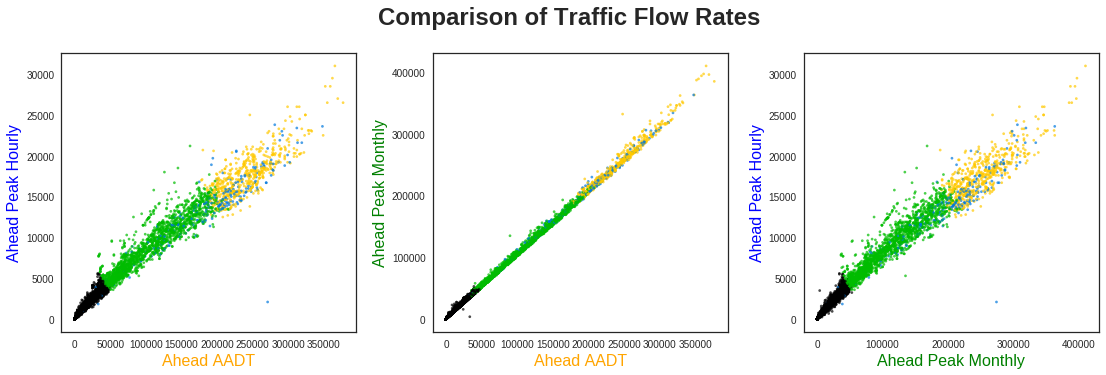
Before this, however, let’s take a look at how these variables compare to each other, starting with the traffic rates.
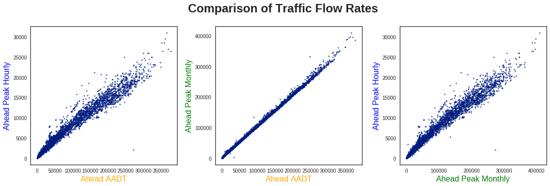
Unsurprisingly, each of these values seems fairly well correlated with one another, especially the AADT and Peak Monthly values. As such, for comparing with the remaining variables, I only show the traffic flow rates for AADT.
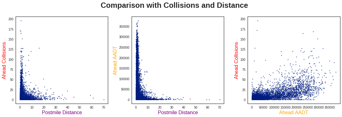
There are a few key observations to be made from these three plots:
First, from looking at the two Postmile Distance plots, the collisions and traffic flow seem to behave similarly. This is effectively in line with my “more cars, more collisions” idea, so it is not too surprising.
Second, the traffic rates seem to be inversely proportional to the Postmile Distance, and similarly for the collisions. While this initially surprised me, after thinking about it more I realized this was also quite logical. Namely, high-distance / low-traffic points would be common in more remote areas with less on/off ramps. There is no reason to divide such road segments any shorter, as all of the traffic would continue along this route anyways.
Lastly, in comparing the collisions and traffic flow, I don’t see any obvious way to cluster these data. Let’s see if machine learning can find a way! (Spoiler Warning: it does!)
Clustering Algorithm
Before analyzing the clustering results, the first step is to decide how many clusters are suitable for the dataset. Generally, this is done by calculating some metric for success (such as inertia in K-Means Clustering), and finding the point where using more clusters has a degraded effect. This is commonly known as the Elbow Method, shown below:
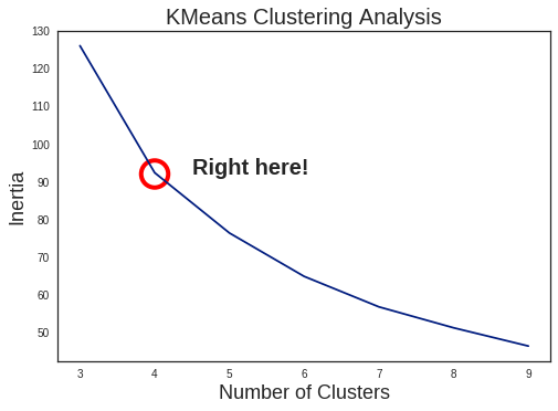
Personally, I’m not a huge fan of this method, as it tends to be somewhat arbitrary. It can work fine for simple, well-divided cases (which K-Means also excels at), but the scatter plots above do not seem to fit such description. In fact, looking at the results of K-Means with 4 clusters, it doesn’t look great:
Just drawing straight line cutoffs on the AADT rates? I could have done that…
Spectral Clustering
As a result, I decided to use a different method: Spectral Clustering. In brief, K-Means works by directly using feature distance (or similarity) from the designated cluster centers. This works fine for clearly identifiable clusters with radial symmetry, but not for more complex cases. In Spectral Clustering, the process is a bit more complicated:
- Calculate the similarity matrix () of the dataset (such as with negative distance)
- Construct the Laplacian matrix ()
- Use this to solve the Eigenvalue equation ()
- Take the eigenvectors of the lowest eigenvalues as a basis
- Identify clusters (using K-Means) in this new basis, and label points accordingly
Skipping some of the mathematics behind this, the main idea is that each cluster corresponds to a constant eigenvector with eigenvalue . Therefore, taking the lowest of these to construct a basis corresponds to identifying individual clusters.
The notable advantage to this method is identifying clusters occurs in similarity-space, not in feature-space, as in K-Means. This greatly helps identify clusters which are not compact, a situation where K-Means struggles. As a note, a similar type of dimensionality reduction is utilized in Kernel Principal Component Analysis.
Note: a very useful paper for understanding these ideas is A Tutorial on Spectral Clustering.
For a more physical context, we can visualize the array of data points as each being connected by a spring. The stiffness of each spring corresponds to the similarity of the points it connects. Each of the points which are tightly clustered tend to move together with low-frequencies. Looking for these slow movements (i.e., small eigenvalues) represent the individual clusters.
1.4 Results and Interpretation
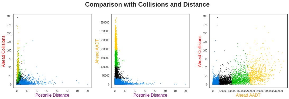
After applying Spectral Clustering to our data, the output looks much more reasonable:
The clustering has divided the highway segments into three primary categories using their traffic flow rates: low (black), medium (green), and high (yellow). Scattered throughout these, however, are a variety of blue points. What do these segments correspond to? Let’s compare the traffic flow rates to the total collisions and distance:
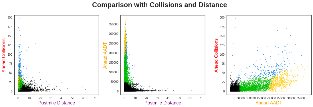
From the far left plot, we see these blue points are shorter distance segments with very high collision rates. However, there is not a clear differentiation of clusters below ~10 miles. This indicates Postmile Distance is probably not very useful for separating the clusters, aside from those points with longer distances.
The far right plot, however, gives very clear insight into the behavior of this dataset. Namely, the majority of segments fall into clearly defined groups with collision rates that increase with higher traffic. However, across the entire distribution of traffic flow rates, there are a number of points with consistently higher collision totals than this baseline. The clustering algorithm has identified segments with anomalously high collision rates.
1.5 Conclusion
Using the collision reports gathered by the California Highway Patrol, and the traffic flow rates from the Caltrans Program, I set out to investigate the rates of collisions on California Highways.
After grouping these reports by their respective locations, I found the total number of collisions occurring on each highway segment. It was clear these rates were correlated with the traffic flow rates on each segment, but not explicitly clear how they could be appropriately categorized.
By utilizing Spectral Clustering, I was able to split these data into four distinct segment groups. Three of these followed a general trend of “more traffic means more collisions”, while the remaining points were clearly anomalous.
These results can be utilized in a number of situations, such as:
- Planning a vacation involving lengthy driving over new roads
- Identifying reliable transportation routes for shipping companies
- Comparing commuting routes for alternatives to frequent-collision areas
Future Work
While these results do provide immediate benefit, there are certain aspects which could be improved upon. Namely, the situations which utilize this information generally involve planning ahead, and do not cover any seasonality effects. In this section, I list several aspects which could be improved with further study, or access to other relevant data.
1. Time of Day
Since most highway routes are heavily dominated by commuting traffic, there is assuredly a difference between collisions in the morning and evening. In order to try and deal with this, I tried splitting the collisions into four time bins based on commutes (Morning, Evening, and the two periods of downtime between them):
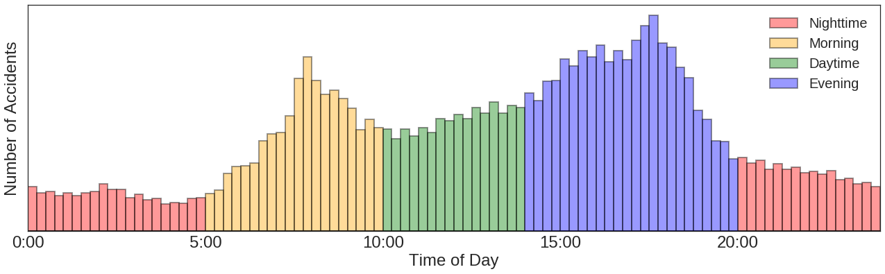
With this split, it is simple to divide the total collisions into Morning Collisions, Evening Collisions, etc. However, by doing so, it became clear that many of the points had too low of statistics to give meaningful results.
In order to improve upon this, one idea I had was combining multiple segments together. This would decrease the fluctuations observed over such points, but I did not have a clear methodology for doing this. With a longer investigation, this process would likely be useful for further analysis across multiple features.
2. Time of Year
3. Cause Identification
Visualizing Collision Rates
To better visualize the collision risk found above, this second part focuses on the web application created to showcase the results.
For translating the clusters into relative risk of collisions, I am making two assumptions:
- There is a general risk level which predictably increases with traffic flow rates
- There are unidentified factors which greatly elevates the risk in certain areas
Given this definition, I am assigning the three predictable groups to have increasing rates of risk, while the highest is from is the anomalous points identified above:
| Potential Risk | Cluster |
|---|---|
| Low | Cluster 0 |
| Medium | Cluster 1 |
| High | Cluster 2 |
| Very High | Cluster 3 |
Note: this is the risk of a collision occurring in general, not from being directly involved.